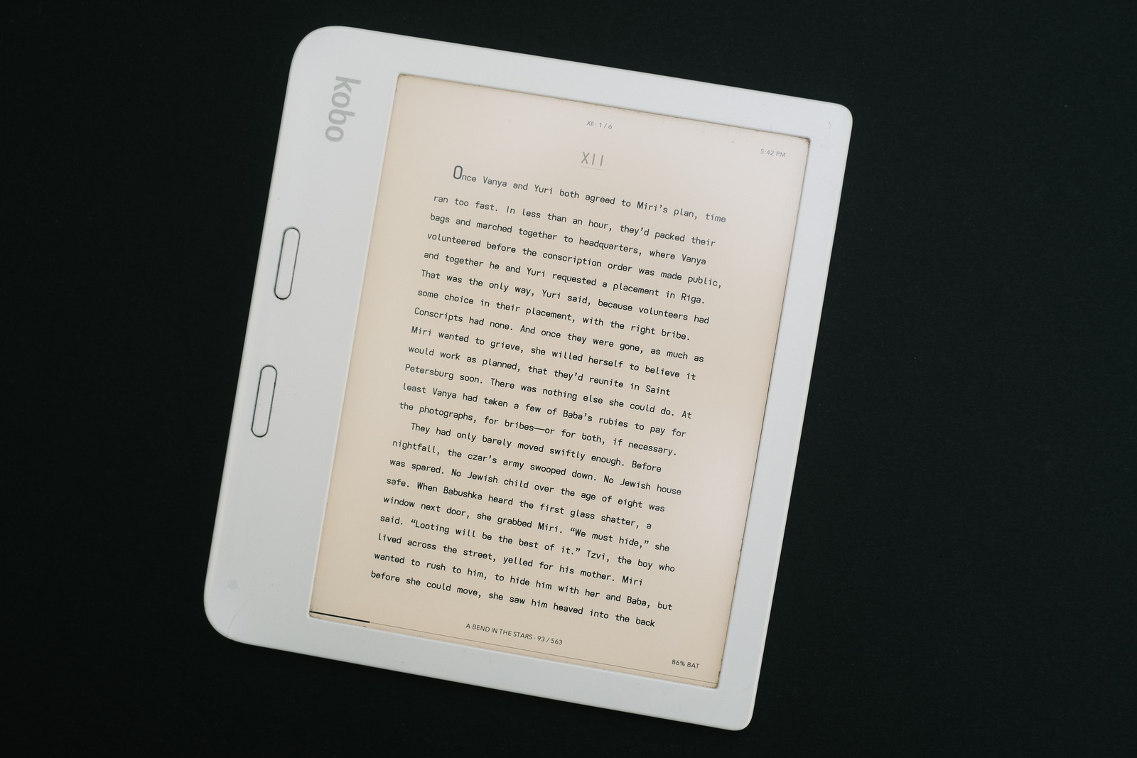
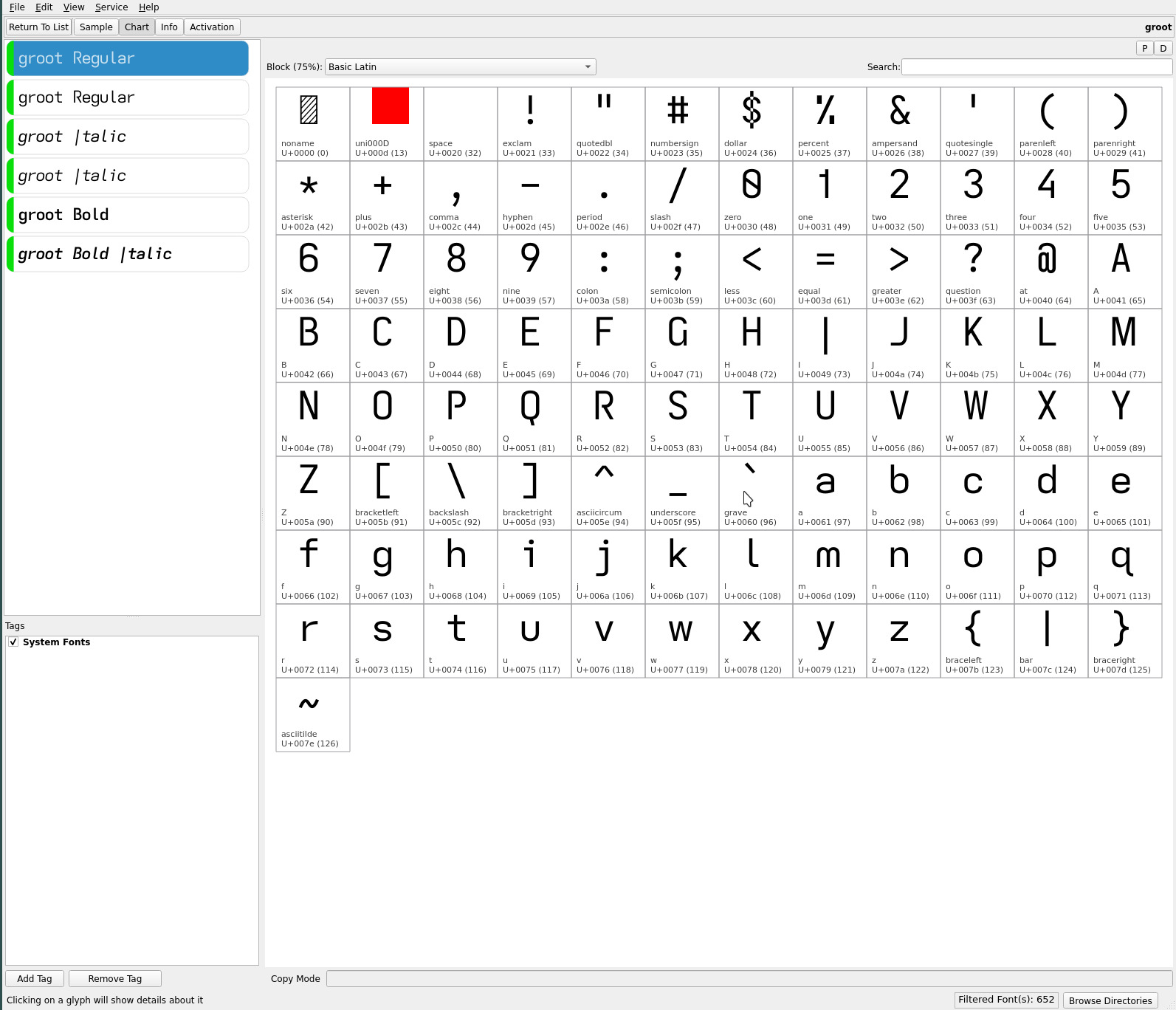
groot font
with the addition of the toothless double-storey lower case a to the descending caps typefaces, i realized i lacked a font with non-descending caps.
Enter the typograffic font variant..

the groot font with the toothless a and a number of other glyph embellishments inherited from the mu/umu typefaces..

It differs from the typograffic font..
| upper case | typograffic | groot |
|---|---|---|
| B P R | closed | open |
| G | toothless-rounded-serifless-hooked | toothed-serifless-hookless |
| I | serifless | descending serifless |
| lower case | typograffic | groot |
|---|---|---|
| a | double-storey-serifless | double-storey-toothless-corner |
| f | flat-hook-extended | flat-hook-serifless |
| j | flat-hook-serifless | flat-hook-serifed |
| numeric | typograffic | groot |
|---|---|---|
| 4 | closed | open non-crossing |
This produces, for lack of a better term, a “flatter” font with a minimal number of glyphs with descenders. Line spacing looks more pronounced without the descending caps and extended lower case f. The one exception, the distinctive descending capital I, IMO attains the readability of its serifed counterpart whilst retaining the “clean” lines of a sans serif font. YMMV.
This now returns me to a working font trio of mu, umu and now groot.
repos
The current ereader fonts may be found on OneDrive.